#tutorial: adding a dark mode toggle
Explore tagged Tumblr posts
Visit Tumblr Blog
Explore Tumblr blogs with no restrictions, modern design and the best experience.
Last Seen Tumblr Blogs


Fun Fact
70% of Tumblr users say the Dashboard is their favorite place to spend time online.
Note
hi, your gifs are extremely good, I'm sincerely intimidated by your talent so excuse me for the anon ask. I was wondering how did you make this blending? /post/739252081037328384 What was the process to make it look so good? cause I'm trying to do a similar blending with another anime but it's getting hard (and honestly, turning ugly ajskd) thank you
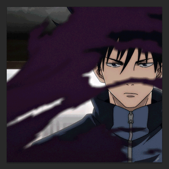
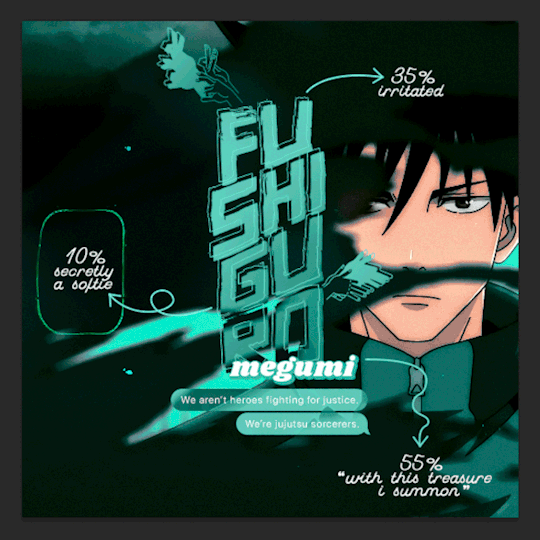
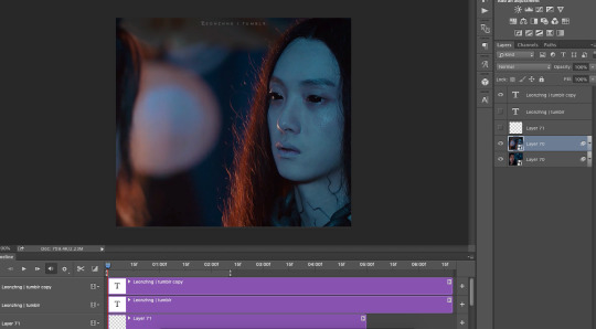
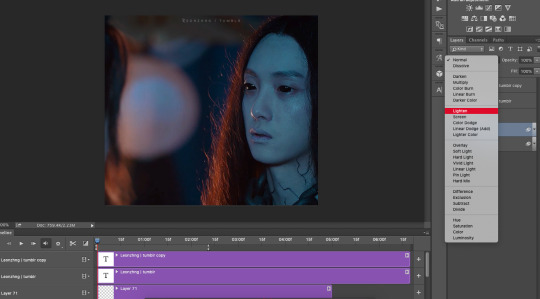
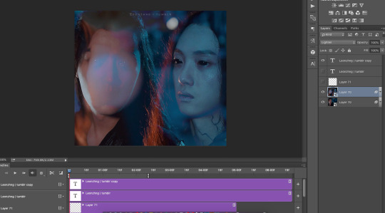
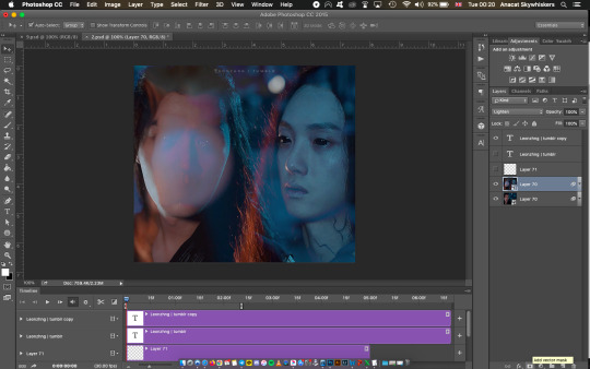
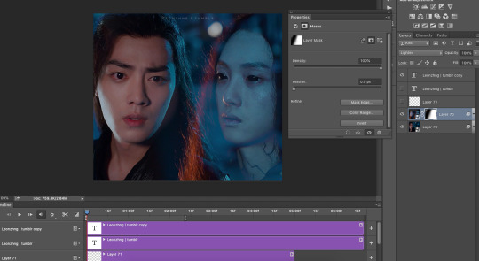
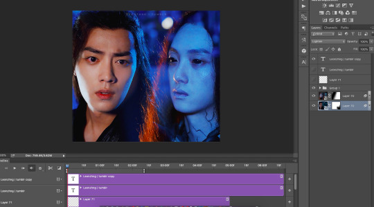
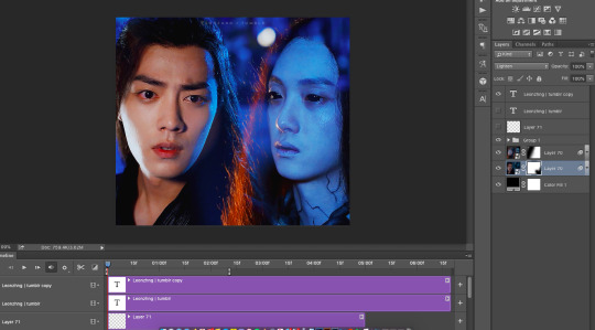
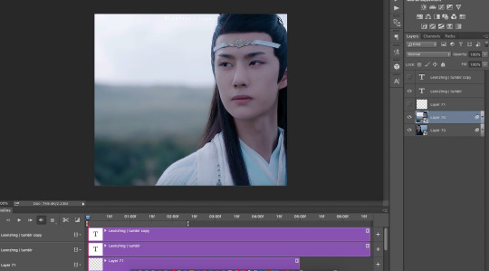
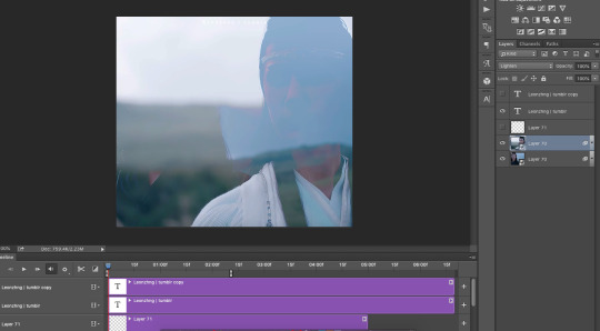
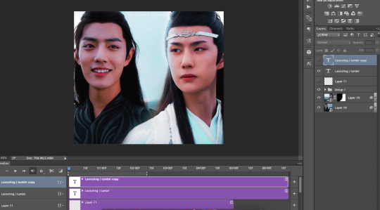
hi! thank you so much 🥺 i'm so sorry for the late reply btw. tbh blending is always hard for me to explain. so i put together a few progress gifs and videos to hopefully demonstrate how i went from start to end, and i'll do my best to add commentary at the end. i'll show the megumi gif from that set, since it had the most layers:
(click for full size) 1. each individual gif before and after coloring + masking (erasing) // 2. each gif being added to the composition
(there's no sound on this video. here you can see me toggling on/off my adjustment layers to demonstrate some aspects i'll explain below the cut)
key parts of blended gifs for me:
choose scenes where the focal point (megumi's face) can be made to stand out. for that, i'll look for scenes against very dark backgrounds or solid backgrounds that can be darkened. when you set a gif to screen (the blend mode used for blended gifs), the light areas of that gif will stand out the most against the dark areas of the gifs underneath
choose scenes with minimal pulsing/harsh/fast movements but with fluid, soft movement (for anime since this style of animation has a lower fps). scenes with enough movement that aren't too jarring can be hard to find in shonen since there's so much action, but some of the best scenes are those "hero pose" moments where their hair blows in the wind lol (one of my fav scenes to gif is gojo in at shibuya station after choso first tries to hit him with his ct bc his blowing hair is animated so gracefully sldkfjs). in this case, i have todo's torn shirt breezing in front of megumi's face. i knew it would be a great shot to blend with bc i could darken the purple of the shirt and any gif layered above those spots would stand out against it
use layer masks and adjustment layers to "erase" distracting parts of the gif. as you can see in the video, i've erased huge chunks of some of my gifs. i often also use levels with a layer mask to darken select parts of my gif (even reducing the white point as shown in the base gif) + hue/sat to darken specific colors in a gif.
so one of my best tips for coloring is to focus on scene selection, masking, and darkening!
i know it's not a full blending tutorial, but i hope there's something here that can help you. i've also talked about parts of my blending process in these asks:
[one]
[two]
[three] (i've been told tip 2 has been super helpful for ppl)
[four]
if you're interested in reading other inquiries, i have a specific tag #nik.help and all my tutorials are tagged #resource* :)
and good luck with your anime gifset! keep at it! blending can be frustrating but trust the process and i'm sure it'll come out stunning!
14 notes
·
View notes
Text
November 2023 Development Update
Hello there, happy November! Gosh, it seems like the month flew by! Where does the time go?
I was a bit sick and had quite a bit of stuff going on IRL this month, but I've been making slow and steady progress!
The basic migration from Unity to Godot is almost complete! There are still a few things that I need to think about adding (content warning popups and interactive tutorials, for instance) as well as new features that need implementation (unlockable CG and ending galleries), but overall things have gone smoothly.
I coded the GUI for the Archives/Help, Settings, and Gallery pages. I also programmed around half of the settings, including the fullscreen toggle, dark mode toggle, and font options. I also coded in most of the basic sprite, CG, and background management, with some "polish" features, such as fading transitions and instantaneous animation on rollback. On the less interesting side, I did a number of bugfixes, including an error where bold/italic dialogues weren't displaying properly and some adjustment of Open Dyslexic so that the line spacing is more similar to the other dialogues (to avoid text overflowing from the screen when you swap to that mode).

In terms of art, I animated the main sprites for TDW and worked on the storyboard/rendering for the CGs. I'm about halfway done with the art overall. In the past I've mainly done static mouths since animating "mouth opening" can be a little tricky, but I experimented with it this month, and now quite a few of the TDW sprites have mouths that open/close/animate smoothly between different mouth shapes!
PLANS FOR THIS MONTH
Since the basic coding is largely done (talk about a pretty major detour that I didn't expect to take), I'll be diving headlong into TDW development for now. My goals for November are to finish and revise TDW's script and get the art around 75-80% done before moving on to GUI!
Thank you to everyone who's keeping up with development! If you want to hear from me more often, I' post most of my major announcements on Tumblr and I'm also fairly active on Twitter/X. I also post almost daily on my Patreon with sketches, writing snippets, sneak peeks, high resolution art, and weekly devlogs.
5 notes
·
View notes
Note
Hello, I've got a coding question if that's alright! I'm using your Wärme theme for my blog and I love it!! I would like to add a night mode toggle to it using altindie's guide! (if that one isn't compatible, lemme know!) I'm unsure where I should place all the css/script so it doesn't mess up anything, if that makes sense? I won't lie, I'm a complete newbie to doing a big edit like this, so any pointers help XD
Hello, thank you for using and enjoying my theme Wärme!
I'm going to be honest, installing a dark mode toggle to Wärme will be quite a lot of work, mainly because I didn't use CSS variables back when I made it. If you want me to, I could update the code to have a dark mode toggle; however, since this would be a bigger edit from my side, I'd ask for a donation of 3 ko-fis for my work.
If you really want to install a dark mode toggle by yourself, here's what you have to do (under the cut because of the length):
(1) Find <html> in line 2 of my code and replace it with <html lang="en" data-theme="light">.
(2) Wrap the first JavaScript code from Flipse's guide in <script></script> tags and paste it before line 3438 (that's where the tooltip script starts).
(3) Wrap the second JacaScript code in <script></script> tags and paste it before line 140 (where the meta variables start).
(4) Replace all notations like {color:Background} or {color:Text} with var(--BG) and var(--Text), respectively. Make sure you do this for all color variables.
(5) Add the :root targets right after <style> and before body { … }.
(6) Start with the light mode, for example:
:root, html[data-theme='light'] { --LightOn: block; --LightOff: none; --BG: {color:Background}; --Text: {color:Text}; }
(7) Next, set up your dark mode, for example:
html[data-theme='dark'] { --LightOn: none; --LightOff: block; --BG: {color:Background Dark}; --Text: {color:Text Dark}; }
(8) To make sure that the night mode colors work, add the color meta variable tags before <style>, e.g.
<meta name="color:Text Dark" content="#fff"/>
(9) After changing to CSS variables and adding night mode colors, add the snappy transition by pasting the code after the :root elements and before body { … }.
(10) Paste the code for the button after <!-- // end custom controls -->. Since my code uses Remix Icons, replace <i data-feather="moon"></i> with <span class="ri-moon-line"></span> and replace <i data-feather="sun"></i> with <span class="ri-sun-line"></span>.
(11) To make the button match the other buttons, change <button id="theme-toggle" …> to <button id="theme-toggle" class="cont" …>.
(12) For the CSS of the button, add the following lines before </style>:
.light-on{ display: var(--LightOn); } .light-off{ display: var(--LightOff); } button#theme-toggle { right: 8px; top: calc(2*36px + 2*6px);}
(13) Enjoy your dark mode toggle!
#axeltornadoes#eossa#blog#support#answered#t24 waerme#theme 24#issue: dark mode#tutorial: adding a dark mode toggle
1 note
·
View note
Text
elio’s colouring tutorial! <3
i've been getting a lot of asks about my colouring process and requests for colouring tutorials, so i finally decided to make one! using a few gifs as examples, i'll show you how i turn backgrounds into a vibrant colour. this tutorial assumes that you already know how to gif; we're jumping right into the colouring!

(disclaimer: just keep in mind that this is what works for me, experimenting is the best way to learn what works for you ahshdgjg anyways, here we go, under the cut!)
four things i keep in mind when i want to make a colourful gif:
scenes should have backgrounds that aren't complicated or full of other objects (especially if they're dark)
scenes should have backgrounds with colours that are easy to manipulate. i.e. a simple blue background will be much easier to change than a background that has a mixture of green, red, and brown.
scenes shouldn't have a lot of movement. scenes with limited movement will save you from a migraine.
avoid dark scenes!!! it's really hard to colour a dark scene, and most of the time, it doesn't turn out looking as vibrant as other scenes.
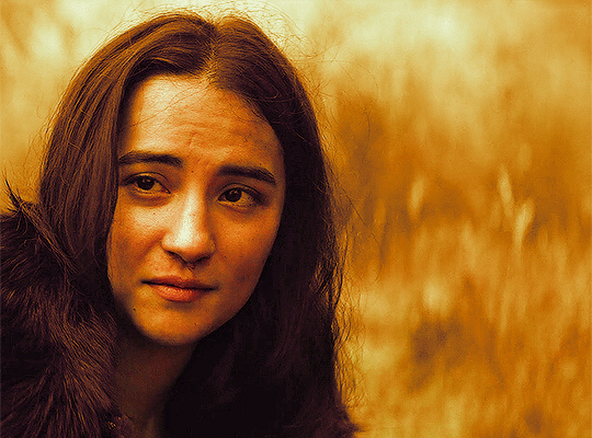
this alina scene from shadow and bone isn't the best because the lighting is on the darker side, but the relatively solid blue/green background made it doable. that being said, it would have been much less time-consuming if it was brighter.
step one: brightness.
the first thing i always do is click on "brightness/contrast." leave the toggles at 0, but change the blending mode to screen. this generally gives you a decent brightness without overdoing it.
now, if this was a regular gifset, i would move on to "curves." for a vibrant colouring set, i leave that for last. the results turn out much better if your curves layers are on top of your colouring layers; order layer matters!
step 2: hue/saturation.
generally, you won't want to touch this too much because it changes the overall appearance of your gif and can affect things like skin tone. however, you do want to move it subtly either to the left or right depending on what colour you want your final gif to be! think of it this way: the point of hue/saturation is to get your gif (especially your background) to a colour that's easy to manipulate so that your "selective colour" layers work better!
this alina starkov scene has a relatively blue background with mild splotches of green. the blue is easier to manipulate than green since there's more of it, so i'll move the hue/saturation to the right (+8) to make the gif a little bluer.
step 3: colour balance.
colour balance works the same way — use it to change the colour of your gif so that your selective colour layers are stronger.
play around with midtones, shadows, and highlights. don't overuse these, or it'll be a pain to fix other parts of your gif later (i.e. a person's face). again, i made the gif look more blue and less green with this colour balance layer. this is how my gif looks now, with a before and after included so you see what i meant about going from green -> blue:

*i also added two subtle selective colour layers (set on "relative") after the colour balance to make alina's face less grey.
step 4: selective colour
alright, this is where the real colouring comes in!!! selective colour layers are your best friend when you want vibrant colours in your gif. now that we've made the scene take on a bluer tone than green, click on "selective colour." you’ll see two options when you click on it: absolute and relative.
i recommend beginning with absolute, not relative. absolute is stronger than relative, and will therefore give you more vibrant results. you can use relative to "touch up" later.
the key to selective colour layers is to alternate between absolute and relative. think of the absolute layers as a way to set the foundation for a new colour, and the relative layers as a way to subtly fix little things afterwards. the number of selective colour layers will differ per scene and gif. sometimes, i'll have 5 absolute + 10 relative, and other times i'll have 10 absolute + 2 relative.
there's no right answer for how you play around with the toggles in selective colouring, because again, it will differ per scene.
for this gif, the first thing i did was go to the cyans (absolute) and dragged the toggle for "cyan" all the way to the left (-100), magenta (+8), and yellow (+38). this got rid of the cyan tones, but that's alright, because the point of establishing this blue tone is so that the colour of the entire gif is easier to manipulate.
for blues (absolute), i did the following: cyan (-48), magenta (-27), yellow (+100). this gets rid of the blues almost entirely, leaving us with a light grey and neutral tone.
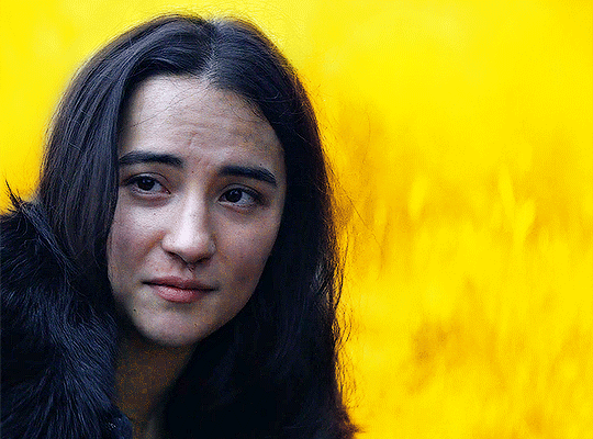
since we now have this neutral tone, i went to neutrals (absolute), and moved the toggles: cyan (-25), magenta (+10), yellow (+100). i also did black (-5) to make the scene a little brighter. now, after all of this, our background is orangey-yellow. the only problem is that it's also affected alina's face, so our gif looks like this:
definitely not the look we want the final gif to have. but this is alright! don't be afraid to make your scene look intense, because your layer mask will help you!
click on your layer mask — the white box next to the selective colour layer. make sure you click on the layer mask of the selective colour layer that's affected the person's face. so, mine would be the "neutrals" selective colour layer. then, grab the brush tool, set the colour to black, and colour over the face/other necessary areas. anywhere you paint black on your gif, the selective colour layer's effect will be erased. if you make a mistake, change your brush tool colour to white and paint the layer back.
my gif looks much better now, and alina's face is no longer orange. but i want the background to look yellow — this is orange. now that we've established a vibrant colour background, it'll be much easier to work with — getting here was the hardest part!
i made another selective colour (absolute) layer. i usually like to have at least two absolute layers before moving on to relative layers.
now that our background is orangey-yellow, we can dive right into the yellows of our selective colour layer. i moved the toggles like so: cyan (-100), magenta (-9), and yellow (+100). this gives me a light yellow colour, but there are still darker splotches in my gifs. this isn't an issue; i just moved black to -40 and fixed most of it.
now that we have a vibrant colour that's similar to the shade we want, it's time for our relative selective colour layers. my gif looks good, but i want it to take on an even more vibrant shade.
make a new selective colour layer and click relative. the changes you make with relative will be subtler than absolute, but because we've established such a vibrant colour already, relative will be perfect! i moved the toggles like so: cyan (-100), magenta (-33), yellow (+16), black (-6). now my gif looks like this:

this gif turned out pretty good without a lot of trouble, but sometimes, i'll have to go ahead and add another absolute layer, then another relative layer, etc. again, like i said earlier: alternate between absolute and relative selective colour layers!!!!
step 5: new layer + brush tool
i could leave this gif as is, but i still think that the darker splotches ruin the overall look. to fix this issue, i made a new layer, used the eydropper tool to find the right colour, and used the brush tool to colour over these areas. again, i usually have multiple layers where i manually colour over certain areas. for this gif, i have 5 layers.
i tend to set the blending mode to soft light because it gives the best results. colour works too, but i find that it tends to make the colours look a bit flatter.
near the top of alina's head are whiter splotches. those bothered me as well, so again, i made a new layer and used the brush tool to cover them. i didn't change the blending mode though. i kept it on normal but lowered the opacity (for this gif, to 63%). this works because there isn't a lot of movement in the gif, so it doesn't look messy. darken will colour in your white spots too, but that doesn't work too well sometimes — in my opinion, keeping it on normal and messing around with the opacity looks most natural.
this is how my gif looks now:
step 6: curves
now that our colouring is done, it's time for curves!
if you click on the curves layer, you'll see that there are three little droppers on the left. i use the first and the third.
click on the first dropper, then click on the darkest point of your gif. then use the third dropper to click on the whitest part of your gif. this will help balance out the brightness and contrast. if your curves are too extreme, lower the opacity.
if your gif doesn't look good with the curves layers, just scrap them. you can fix most of the brightness with a new selective colour layer. for this gif, i used curves and a new selective colour layer to make alina's hair look darker and less blue. this also helped balance out the overall brightness of the gif, as well as her skin tone.
step 7: vibrance
slap on a vibrance layer, but leave the saturation alone. for this gif, i did vibrance +37.
andddd that's it!
this is what my final gif looks like:
*the area around her neck is a bit too pixelated, but it was fine because this gif was originally used in a 268 px gifset, so it wasn't noticeable.
but this is an issue that can happen with vibrant colouring! so, what if the gif turns out too pixelated after a lot of colour manipulation?
this is an easy fix if your gifset doesn't have a lot of movement (and in some cases, even works with some movement!) here's an example.
this gif was given a vibrant purple colour by doing the steps listed above. i've included a before and after so you can see the colouring.
but if you look near the top, it's very pixelated and messy because of how much brightness/colour manipulation has happened. we can fix this by making a new layer, using the eyedropper tool to find a similar shade of purple to the background, then colouring over those pixelated spots.
keep the blending mode on normal but lower the opacity so that it blends seamlessly. for this gif, 48% opacity worked.
my gif now looks like this:

it's not perfect. if you look closely, you can see that some of the purple is painted over spider-man's head at one point since there's a lot of movement happening here. you can sometimes fix this by using the eraser tool with a significantly lowered opacity (i.e. 15-30%). but the main point is, the pixelated areas look much better and less messy, and overall, the gif has a more cohesive look.
AGAIN, the key idea of vibrant colouring:
the key idea of vibrant colouring is, in my opinion, this: manipulate the overall colour of the gif with other layers so you can use selective colour to achieve your vibrant colours.
one method that i sometimes use (but didn't for the previous examples) is to take your gif, do all of the steps, but focus especially on new layers + brush tool to help you colour your gif. here's what i mean.
this admittedly awkwardly coloured gif of MJ was originally blue. this vibrant blue was achieved by making a new layer and manually colouring in the background after doing all the other steps. it was blue before, but it certainly wasn't this vibrant without the multiple manually-coloured layers. you can see what i mean in the before and after:
since we have this vibrant blue colouring, adding a selective layer on top of this will give us fantastic results. since your gif is blue, go to cyans and blues on a selective colour layer.
with the help of three selective colour layers that alternate between absolute and relative, my final gif looks like this:
if i hadn't used new layer + brush tool to manually colour this gif's background, it wouldn't have ended up so vibrant — or if it had, it would've taken me much longer.
so, again: focus on manipulating the entire background so you can take full advantage of selective colour layers!!! with practice, it gets easier.
that's it from me! i hope this overly long tutorial was helpful! give it a like or reblog if you found it helpful, and feel free to reach out to me if something's unclear!!! happy giffing <3
#allresources#useralison#userkosmos#usersem#userrainbow#useryoshi#tuserabbie#usershreyu#usernorah#larlies#tuserdi#userace#usermorgan#tuserems#userrobin#usercharisse#usercas#xuseremily#usercim#*mytutorials#listen besties. idk what i'm doing half the time#a lot of my colouring is just—#click click click oOOH THAT LOOKS GOOD LETS KEEP IT#i am PRAYINGGG that this tutorial makes sense
797 notes
·
View notes
Photo
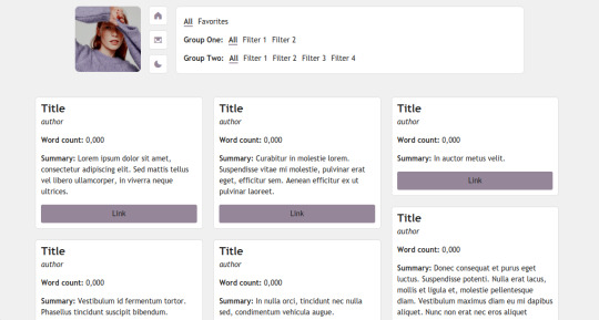

page 08: 3 am (preview + code)
a simple page I originally made as a ficrec page, but can be used as a regular bookshelf or media page.
features and options:
125px icon
one accent color
multiple filters and groups can be added
light/dark mode toggle
responsive
credits:
isotope combination filtering tutorial by magnusthemes
preview icon made by meredithsdardenne
Phosphor Icons
notes:
a basic knowledge of HTML is recommended, but everything should be pretty simple and easy to customize.
instructions on how to customize are through the code.
you may:
edit as much as you please / to your liking
you may not:
use as a base
claim as your own
take parts of my code and use them elsewhere
[problems / tip jar ]
838 notes
·
View notes
Text
The Overlay Blending Mode In ON1
If you are trying ON1 Photo RAW, the ON1 plug-ins like ON1 Effects or ON1 HDR, or upgrading your ON1 software to a newer version, please consider using my affiliate link. There is no extra cost to you and it helps support ON1 tutorials like this one. Ready to buy? Use the offer code SDP20 at checkout and SAVE 20%!
This article is part of a mini-series about the blending modes in ON1 Photo RAW and ON1 Effects.
What Is The Overlay Blending Mode?
Overlay is the top member of the “contrast” group of blending modes for a reason. This mode increases contrast in a scene by darkening dark pixels and brightening lighter pixels. Overlay is one of the most popular blending modes, for its contrast boost is moderate and well-suited to many photos.
I use the Overlay blending mode in two cases often - texture blending and a finishing contrast pop.
Texture Blending With The Overlay Mode
The Overlay blending mode is my go-to mode for texture blending. It is a great starting point. While ON1 has the Textures filter in Effects, I prefer to do my texture blending in Layers. Using a layer gives me more control of the position a texture and opens up creative options to apply adjustments to the texture itself.
The recipe for blending a texture with the Overlay mode is straightforward:
Add a new layer to the layer stack
Use an ON1 Extras texture, one of your own textures, or navigate to any image on your computer
Switch the blending mode of the texture layer to Overlay
In the screenshots below, you can see how smoothly the texture blends into the base image after the switch to the Overlay blending mode.
After switching the blending mode, continue to refine your texture blend with layer Opacity and layer masks.
Pro tip: Apply Effects filters to the texture layer for more creative texture blends. I discuss these techniques in my oldie-but-goodie Texture Blending In ON1 Layers video course.
A Finishing Contrast Pop With The Overlay Blending Mode
The Overlay blending mode is an excellent finishing touch to your landscape photos. Also, you can tap into this blending mode directly in Effects. As the final adjustment to your editing, try this:
Add a Color Enhancer filter to the filter stack.
Click the Gear menu in the Color Enhancer filter and change the Blending Mode from Normal to Overlay.
Lower the Opacity slider to around 20%
That’s it. Toggle off and on the Color Enhancer you just added. See how your photo pops! The Overlay blend mode boosts contrast and enriches color in quite a natural way.
Pro tip: Add a custom style in the Color Enhancer filter for a faster workflow.
How Does Overlay Work In ON1 Effects?
Your photo passes through each filter in the filter stack from bottom to top. Along the way, its pixels are modified by the filter, and the resulting pixels are fed into the next filter up the stack and so on. The final set of pixels (your original photo and all of the adjustments from the filter stack) emerges from the top and that’s what you see in the preview area.
Adding another filter with the Overlay mode blends that sum total of pixels with itself, applying the contrast boost that makes the Overlay blending mode so lovable.
Why Use The Color Enhancer Filter?
You’ll have noticed that none of the sliders in the Color Enhancer filter are adjusted. The magic of this technique is the blending option, not the filter itself. I like using the Color Enhancer filter for this because its default settings make no change to the photo - all the sliders are set to zero. That makes the Color Enhancer perfect for leveraging blending modes to mix an image with itself.
Up Next
This series continues with another mode in the contrast group, the Soft Light blending mode.
4 notes
·
View notes
Note
hi there! i really like your reinterpreted "this is my family" gifset and i was wondering if you could explain how you blended scenes together on the 2nd and 6th gifs? or if you know of any tutorials that explain it? yours are so seamless!!!
oh thank you!! when I first started trying out gif blending I referenced a few old tutorials, like this and this, but along the way I’ve kinda just... done my own thing and played around a lot with masks (─‿‿─)
I’ve taken screenshots of what I did and I’ll try my best to explain it below!
for the second gif of this gifset:
1. I loaded the two gifs into the same photoshop file and converted to timelines and sharpened
2. for this particular gif, I changed the blending mode of the wn layer to “lighten” which is the mode I use for a lot of my more complicated overlay gifs as well, like the second gif here
with the lighten blending mode, basically what happens is that the lighter pixels show up instead of the darker ones, which is why wn’s hair (which is dark) is now semi-replaced by the lightish (in comparison) blue background on the wwx layer while his pale face is still quite opaque, and also why wwx’s biutiful face is now covered by a gigantic blob of light (-ω-、)
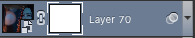
3. to remove that blob of light and grace the world with wwx’s biutiful face once again, I selected the wn layer and applied a mask (see bottom right, click that thingamajig that says “add vector mask”)
and with the mask layer selected,
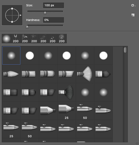
I used a soft brush at 100 px (ofc changing the size when I needed to go finer or larger)
and brushed over wwx’s face to remove the light (see that dark spot on the mask, dark = hidden part of the layer, white = part of the layer that’s seen)
when brushing over the mask, I’ll usually also toggle back and forth over the timeline to check if the mask covers what I want to cover throughout the entire gif. it’s not so bad here because in the scenes I chose, wwx and wn stay relatively still so the mask looks like it’s always covering the same area. but if your scenes have a lot of movement, the mask may be covering the area perfectly in one frame but in another when the subject of the scene has moved away, the mask is covering the wrong area now >-< it’s definitely a lot trickier... scene selection is super important when blending gifs!
4. and then I did my colouring! because I was lazy here I used the same colouring layers for both lol usually if I’m feeling studious I do separate colouring for the two layers

but after the colouring, I realised that wn looks kinda faded out and translucent because of the background on the wwx layer
5. so I added a mask on the wwx layer as well to make wn’s neck area slightly more opaque
this what I meant when I said earlier that it’s a lot of trial and error; blending really depends on the scenes you choose and the colouring! most of the time you’ll have to keep going back and forth between your layers to mask areas that you want to keep and want to hide
but! there seems to be an area at wn’s hair where the background of the psd is showing (those chequered grey and white squares) ∑(O_O;)
6. so to cover that up I added a black fill layer right at the bottom
and that’s it!
meanwhile for the sixth gif in that same set:

1. I started similarly by loading it all in and sharpening
2. but when I tried the lighten blending mode, this happened... *weeps* ┐('~`;)┌
so for this gif, I went with the normal blending mode for both wwx and lwj layers instead, which is why it looks like lwj is fully opaque and standing in front of wwx, as compared to the earlier gif where wn is still slightly translucent (especially his hair)
3. and same as before, I applied the mask to the lwj layer and brushed around until it somewhat crops around his shoulder, hair, and face

4. and added my colouring and that’s it!
other examples of the two different blending/ overlay styles from here to highlight the difference:
below: layer where shen wei is bare faced (on the left) is on lighten blending mode - right side of his face is slightly “translucent”, but on the left, the bottom layer isn’t showing through at all, because I put a mask on the layer where he’s wearing a mask (lol) right where the bare face of the top layer is
bottom: both layers are on normal
and a trick!
all the layers in these two bottom gifs are on normal, some parts look faded/ translucent not because of any change in layer blending mode, but because I’d added a mask on that particular layer but with a gradient (⁄ ⁄•⁄ω⁄•⁄ ⁄)

so yes! there are a lot of ways to do blending and it’s a lot of trying and playing around to see what you can get :p this was a long rambling reply but I hope it helped!
78 notes
·
View notes
Text
the theme that almost killed me and I’m not sure the next will be responsive, or
ele theme #06 - pastel and cats
Static preview and code in the source, with sizes and extra info. Like or reblog if you use! Reminder I have a ko-fi! <3 Change as you please but keep the credit! Also I’m here if there is any problem. Gif above has 540px posts - smaller posts will keep both sidebars at their side when on a 1024px laptop.
I tried to make it even more customizable because @eggdesign‘s poll confirmed that people do like it and aren’t bothered by having many options (like I worried about in the past).
What kind of theme is this? -very basic, non contained posts, a topbar, a main sidebar with optional searchbar, and then optional sidebar2 and banner that you can toggle off. 4 links in the sidebar, 3 in the topbar. You will have to go to the html editor to add more. You could use as personal, fansite (you’ll have to add your own widgets) or rp theme.
quick change of images, rp-style:

What can you customize without going to the html editor?
-pretty much all colors and images. the main sidebar has a linear-gradient function if you want to use two colors for the background, and so does the blog’s bg. Main sidebar also has a bg image, and you can select from the menu the blending mode: if you want no blending and to pick between image or colors, or try ‘screen' or 'multiply', 'soft-light' and more, so you can mix them together and see what works (static preview shows ‘screen’ mode, the gif itself was black with snow falling). Same for sidebar2 but it has only one bg color. besides the blending you can also select: width of post (400,450,500,540) and the blog will adapt (you can also go to meta names and add your own, but more than 540px would mess up the theme’s responsiveness), type of blockquote, and the font of your body/posts, description, blog title, post title, and finally for optional updates and their titles.
rest of options you can customize from the menu under read more because it got long
-you can type the size of: the font of your posts, blog title, post title, description, and the gutter (distance between images in photosets, npf and non) Your optional second title. The titles and infos in your sidebar2. The url, name and text when you hover of each of the seven links in the theme (so if you use an icon instead of a word people can hover it). -you can toggle on and off: banner, searchbar, suggestions when you click on the searchbar (which if you want to keep you'll have to type in the html editor, ctrl + f and block:ifsearchbarsuggestions will quickly help you find them; this is the ONE thing you can't do from the menu), sidebar2, the portrait/your avatar on top of sidebar2, the second title, the rounded borders, and finally unnested captions/the dashboard look: for all posts except text posts and for text posts (latter thanks to @annasthms. Why I separated the last two? Because regular bloggers tend to just reblog, rpers use xkit to edit previous posts and may not like the way those ‘unnested’ textposts look in their blogs, but they may still like to have captions under photosets. So you get to pick if both, none or which gets the unnested captions. Visual example in my source link shows you the difference.
Lots of instructions in the editor.
This blog is also always responsive: when the screen gets smaller and there isn’t enough space for all sidebars and container, sidebar2 will go under the main sidebar. In tablets and phones the sidebars will be in a short container and the posts will start under them. So everything is always there, you just need to scroll.
What other scripts, fixes, and extras this blog has - links to tutorials in my credit page.
-npf posts fix by @glenthemes (searchbar done following their tutorials too), pxu photosets, video resizing fix, lightboxes by @shythemes and fix by @bychloethemes . askbox won't shrink. No more external links with href.li added by tumblr by @magnusthemes. -on the bottom right of each post: button to copy link of each post (by @seyche ), a like button (turns red when liked) by shythemes, a reblog button. Source always visible if there is one (on the left). Scroll to top button by @clcrk-tutorials. Dark, smaller and semi-transparent controls that will grow more visible and bigger when hovered by @painthemes. -On the bottom of the post you also get ‘post type’ by ‘source name’ type of message. Submit post styled a little, since tumblr doesn’t allow to do more than to change the submitter’s name look. Reblogged asks and answers look a little more symmetrical, you can see them in the preview, replies underneath will look like dashboard captions if that’s on. -All text has the same size like in all my blogs.
#themes#codehunters#theme#free themes#free resources#evansyhelp#dailyresources#themehunter#rp themes#rph theme#rph#rpc#fansite theme#main theme#complete resources#resourcemarket#tumblr theme#rp theme#my themes#theme 06#mine
59 notes
·
View notes
Text
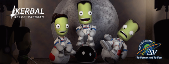
Kerbal Space Program 1.6: “To Vee or not To Vee” is now available!
Hello everyone!
Kerbal Space Program 1.6: To Vee or not To Vee has launched and unlike Hamlet we know the answer - it is definitely to ΔVee...
This update has a great deal of awesome things for you, including new features, beautiful revamps, a number of navigation tools, and a whole lot of bug fixes. We also have added some fun new idle animations for Kerbals, dynamic cube maps that will make shiny parts reflect their environment. We rebalanced and fined tuned various Making History parts, and much more!
With Kerbal Space Program 1.6: To Vee or not To Vee we continue the endeavor of optimizing resources, improving performance, and making KSP the best game it can be through continuous support and meaningful updates.
Let’s go through some of this update’s highlights:
Delta-v per Stage and Delta-v Tool App
Plan missions better and find flaws in your ship staging setup with this long requested feature that will let you visualize the Delta-v values along with a range of other technical data for each stage and the vessel overall. Plus, a Delta-v App that will allow you to see a vessels Delta-v information while you’re building it in different situations. No Kerbal will be left stranded now… or so we hope.
youtube
Part revamps
To Vee or not to Vee includes 20 fully revamped parts that have been optimized, re-shaped and re-textured, plus more than 40 color variants to make your craft look sleek and beautiful!

Navigation Icons to Launch Sites
A quality of life feature that will help stray pilots find their way back to any Launch Site or Runway. From the Map View players will now be able to activate navigation waypoints to get direction towards the KSC or any other launch sites.

Click here to see an animated gif showcasing this feature.
Helmets Off!
You can now remove Kerbals’ Helmets, as well as their neck rings! But be careful, there is a reason why Astronauts wear Helmets for space travel…
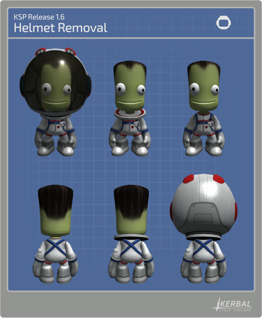
Click here to see an animated gif showcasing this feature.
And much more!
To learn more you can read the full Changelog here:
========================= v1.6.0 ===========================
1.6 Changelog - BaseGame ONLY (see below for MH changelog)
+++ Improvements
* DeltaV Readouts added to Stage Icons/Groups as well as DeltaV App. DeltaV available in Editor (VAB/SPH) and Flight scenes as well as a more detailed Debug menu option.
* Stock and mobile launch sites are now navigable in all game modes.
* Performance improvements for DV calculations that are used by Burn Indicator.
* Recommended UI Scale for the current resolution is now checked on the Settings Screen, working the same as the mini settings where a not recommended UI scale will turn the text red.
* Performance improvements for craft browser menus.
* Craft browser menus now check for craft compatibility.
* Added keyboard arrows navigation for main dialogs and menus. Highlight items with the directional arrows, Accept with the Enter and Space keys, and Cancel is Escape key.
* Generate reflections of the environment to be displayed on shiny parts.
* Improved part search in the editors to give more relevant results with short search terms.
* Adjusted shadows from The Sun to be more precise.
* Add new idle animations when the kerbal is standing in the ground.
* The command parts now have an option to change their 'forward' direction in the PAW.
* Kerbals helmet and neck ring can now be removed by right clicking the Kerbal while on EVA if it’s in a breathable atmosphere.
* Automatic warp to next maneuver node now takes the player to a margin before the start burn time rather than the node itself. Said margin can now be overridden from the default 1 minute via GameSettings.WARP_TO_MANNODE_MARGIN.
* Allow wheel spring and damper advanced tweakables to be set up to a value of 3.
+++ Localization
* Localize the phrase “Advanced Message App:” in the Mini-Settings dialog.
* Some Community feedback for localization strings applied.
+++ Parts
Updated Parts (reskinned):
* Mk2 Lander Can
* 48-7S Spark
* RE-L10 Poodle
* LV-909 Terrier
* FL-A10
* FL-A5
* ADTP-2-3
* Rockomax Brand Adapter
* Rockomax Brand Adapter 02
* TVR-200 Stack Bi-Coupler
* TVR-1180C MK1 Stack Tri-Coupler
* TVR-2160C Mk2 Stack Quad-Coupler
* TVR-200L Stack Bi-Adapter
* TVR-300L Stack Tri-Adapter
* TVR-400L Stack Quad-Adapter
* Small Nose Cone
* Aerodynamic Nose Cone
* Advanced Nose Cone - Type B
* Advanced Nose Cone - Type A
* Protective Rocket Nose Cone MK7
Color Variants:
* Mk2 Lander Can (New “Lander” and “Rover” color variants)
* 48-7S Spark (New “Shroud”, “Truss Mount” and “Bare” color variants)
* LV-909 Terrier (New “Shroud”, “Truss Mount” and “Bare” color variants)
* FL-A10 (New “White” and “Orange” color variants)
* FL-A5 (New “White” and “Orange” color variants)
* ADTP-2-3 (New “White”, “Black and White” and “Orange” color variants)
* Rockomax Brand Adapter (New “Black and White” and “Orange” color variants)
* Rockomax Brand Adapter 02 (New “Black and White” and “Orange” color variants)
* TVR-200 Stack Bi-Coupler (New “Black and White” and “Orange” color variants)
* TVR-1180C MK1 Stack Tri-Coupler (New “White”, “Dark” and “Orange” color variants)
* TVR-2160C Mk2 Stack Quad-Coupler (New “Black and White” and “Orange” color variants)
* TVR-200L Stack Bi-Adapter (New “Black and White” and “Orange” color variants)
* TVR-300L Stack Tri-Adapter (New “Black and White” and “Orange” color variants)
* TVR-400L Stack Quad-Adapter (New “Black and White” and “Orange” color variants)
* Aerodynamic Nose Cone (New “Black and White”, “Dark” and “White” color variants)
* Advanced Nose Cone - Type B (New “Black and White” and “White” and “Orange” color variants)
* Advanced Nose Cone - Type A (New “Black and White” and “White” and “Orange” color variants)
* Protective Rocket Nose Cone MK7 (New “Black and White”, “Orange” and “White” color variants)
Other Part changes:
* Fixed the normals maps on the Stayputnik.
* Fixed the normals maps on the Okto. * Fixed the visible texture seams on the Rockomax X series fuel tanks orange variant.
+++ Bugfixes
* Fix SAS on all probes in Sandbox and Science game modes to operate as per their config files. Game setting allows player to toggle SAS functionality on probes in these game modes.
* Fix handling of docking ports and multiple nuclear or ion engines for DV calculation used in Burn Indicator.
* Fix handling of stages with multiple engines and asparagus staging for DV calculation used in Burn Indicator.
* Fix flashing Burn Indicator and display of DV when vessel are prelaunch.
* Fix Vernor Engines now correctly use Liquid Fuel and Oxidizer on the Engineering report.
* Fix all engines now say "Engine stops under: xx%", instead of "Flameout under: xx%" on their part extended info tooltips.
* Fix Tutorials unable to proceed when the player has a part selected (attached to the mouse) in the editor scenes (VAB/SPH).
* Fix fuel being drained from tanks when fuel availability icon is double-clicked.
* Fix partially executed maneuver nodes gets the closest approach to the same orbit parameters.
* Fix double quotes in stock craft descriptions.
* Fix Contract/Parameters not updating for vessel ownership (such as rescue kerbal) when not in flight mode.
* Fix Drills can operate and generate ore only when deployed and proper surface contact.
* Fix Kerbal IVA crew mass calculation on crewable parts where user/mods have changed IVA crew mass to be > 0 (the default).
* Kerbal IVA crew mass now reported in DV and Engineers report mass totals in editor (VAB/SPH).
* Fix TVR-300, TVR-300L, Moving parts in symmetry works correctly.
* Removed unnecessary horizontal slider in the mini settings UI.
* Fix Summary window no longer appears empty when recovering a vessel with the UI scale at more than 150%, when in a non recommended UI Scale range.
* Fix flickering of fairings in editor scene.
* Further tweaked the sun behavior to stop it from dimming unnecessarily in the Jool Airbreak scenario.
* Fix Intermediate Construction tutorial does not require confirmation when loading the required vessel.
* Fix NRE is no longer generated when rockets crash on the Launchpad.
* Fixed a shader issue that caused the Mk16 parachute to become transparent when within Aero FX.
* Fix cost of fairings shells now is included with initial vessel load.
* Landing gear LY-01, LY-05, LY-10, LY-35, LY-60 and LY-99 can no longer be the first part when you are building a ship.
* Fix last part of interstage fairings not having correct variant applied when vessel is loaded.
* Assigned the correct category to the cfg of all engines.
* Limited the amount of undo/redo steps in the editors to prevent excessive use of memory while building large, complex vehicles. The amount of steps can be adjusted via GameSettings.EDITOR_UNDO_REDO_LIMIT
* Fix Vessel without name cannot be saved in the editor and no longer generates an error.
* Fix part hover highlighting no longers shows from inside IVA or Internal camera.
* Fix inverted interstage fairings not being able to activate when a decoupler below them has activated.
* Fix KSC building upgrade text padding on KSC Building marker UI for scroll bars.
* Fix potential NRE when completing an orbital survey.
* Fix Words no longer duplicate on contracts.
* Fix Burn Bar and Orbit stays the same when a new target is selected.
* Fix An NRE is no longer generated when trying to select the last save game in the save game menu after deleting previous saves.
+++ Mods
* Call OnWillBeCopied and OnWasCopied for children parts when their parent is copied in the editor scene.
* Variants can now disable animations and events.
* Alternative control point orientations can be configured on ModuleCommand.
* Kerbal Helmet check values are controllable via cfg using stock rules or an extra step by overriding code methods: CanSafelyRemoveHelmet, WillDieWithoutHelmet, CanEVAWithoutHelmet
* Kerbals now EVA with a set initial temperature equal to “room temperature” - I mean they were inside with no helmets - can be reverted via GameSettings.EVA_INHERIT_PART_TEMPERATURE
+++Miscellaneous
* Personal parachute kerbal unlock level requirement is accessible for modders in the traits.cfg file and the requirements have been updated to: 0xp for pilots, and 1 xp point for Engineers and Scientists.
* Stock craft have been revised so that they no longer use deprecated parts. The revised vessels are: Aeroequus , ComSat LX , Dynawing , GDLV3 , Ion-Powered Space Probe , Jumping Flea , Kerbal 1 , Kerbal 1.5 , Kerbal 2 , Kerbal X , Learstar A1 , Orbiter 1A , Orbiter One , PT Series Munsplorer , Rover + Skycrane , Science Jr , Slim Shuttle , Space Station Core , Super-Heavy Lander , Two-Stage Lander , Z-MAP Satellite Launch Kit ,Rocket-power VTOL , Satellite Launcher , Stratolauncher.
* Kerbals who board a command seat will make the command seat the vessel reference point only when no other part has control of the vessel.
* The flight camera near clip pane is automatically adjusted when in IVA to correctly display external visuals.
1.6 Changelog - Making History DLC ONLY
+++ Improvements
* Open mission menus now check for craft file compatibility.
+++ Localization
+++ Parts
* The following LFO engines were rebalanced : Wolfhound, Cheetah, Kodiak, Mastodon, Cub, Skiff, Bobcat.
* The following Engine Thrust Plates were rebalanced: EP-25, EP-37, EP-50
* The following Structural Tubes were rebalanced: T-25, T-37, T-50
+++ Bugfixes
* Removed the text “Not played yet” from the tutorial missions buttons in play missions dialog.
* Fix to remove the add button in the Modify Score and Change Score nodes if there are no more options left.
* Fix Kerbals now appear swimming in the correct position on the water when spawning.
* Fix undo function will no longer ignore copied nodes in mission builder.
* Fix handling of engine plates and self-decoupling parts for DV calculation used in Burn Indicator.
* Fix NRE in Mission builder : Changing the "Location" settings in the "Spawn Vessel" node with the described procedure does not generate an NRE.
* Fix Localization description of craft Valkshod 2 on trouble in the Void mission.
* Fix Localization name and description of craft Soy-Ooze 10 on Sally-Hut 1 mission.
* Fix Localization name and description of craft SWM-94 Communications Satellite on Trouble in the void mission.
* Fix Copying Spawn vessel nodes with specific crew creates nodes without crew so they are not cloned.
+++ Missions
+++Miscellaneous
==========================================================
Kerbal Space Program 1.6: To Vee or not To Vee is now available on Steam and will soon be available on GOG and other third party resellers. You will also be able to download it from the KSP Store if you already own the game.
Click here to enter the Grand Discussion Thread for this release.
Happy launchings!
PS: Ask and you shall receive xD
Oh... and if you like, you can download wallpapers of the To Vee or not To Vee art here:
1080x1920p (Most Phones)
1080x2220p (Galaxy S9)
1125x2436p (iPhone X)
Desktop 1920x1080p
Desktop 2048x1080p
Desktop 2560x1440p
28 notes
·
View notes
Text
Gen 8 Predictions/Hopes List
Okay, as a successor to the trailer analysis it was only natural to do this, plus I did something like this three years ago for G7. This is where I extrapolate on everything I think we'll get in Sword and Shield and everything I want to get. In no particular order:
-First off, I'm not demanding some Breath Of The Wild or Super Mario Odyssey-esqe leap forward like a lot of people seem to be doing, and I kind of side-eye those people (including some Youtubers I'm disappointed in because I know they're better than that). That's not sustainable for every single Nintendo franchise or hell every single video game franchise period. What I do want is a smaller advancement that keeps the franchise what it is while adding plenty that is new and interesting and not too gimmicky - to quote @enigma-boi on my Discord server more like the difference between Splatoon 1 and Splatoon 2. I want it to be like the breath of fresh air Unova or even Alola were.
-On the note of those two please have a good plot. It's not a dealbreaker but please.
-Also less of a focus on gimmicks. Mega Evolutions and Z-Moves and such are cool but if you try to top them every gen things get... bloated. This is part of why I don't like the Armored Evolution rumor.
-There's probably going to be at least one Eeveelution. Give me Dragon or give me death.
-DITCH THE CATCHING TUTORIAL. LET'S GO HAD A STEP IN THE RIGHT DIRECTION THERE. PLEASE.
-Hopefully HMs are gone for good too. I'm optimistic they are but.
-Also put your PC in your bag like Let's Go but make it more like the PCs from Hoenn to Alola.
-Nicknaming your Pokemon on the fly should come back too. And LET US NICKNAME TRADED POKEMON FOR GOD'S SAKE
-I feel we'll get it but give us the Pokemon Amie equivalent. Let me pet my Arceus on my big-screen TV.
-On that note. They said this would be a more handheld-oriented experience but I think when docked there will still be motion control some places like the Amie equivalent and in minigames, which are replaced by the touch screen and/or buttons in handheld mode.
-I'm a little sad gyms are back because the island trials in G7 were a nice change of pace but given that weird logo that's showing up everywhere I still have hope Galar's gyms are unconventional. We'll see.
-Minor nitpick but I hope Pokecenters and Pokemarts are still merged here. I know they've only been unmerged in remakes of games predating that concept but still.
-I'm pretty sure it's not coming back this time but I want co-op to make a return. That was fun in Let's Go, even if most of my experience with it was forcing a RL friend that knows jack shit about Pokemon to play with me.
-Speaking of multiplayer! Go back to an online experience more like G6's. Please. I'm begging you Gamefreak.
-Regarding the Galar region and its UK-y nature my one wish is that we get a bunch of pesudo-Arthurian bullshit as part of the setting lore. If there is none I will be forced to make some (and probably do some silly Fate series crossovers while I'm at it).
-References to UK pop culture would be delightfully silly too.
-For the cover legendaries... the logos make me think twin wolves. There's a rumor that it's a metal snake and wooden horse and while I would be 100% down for the metal serpent and the inevitable Metal Gear Solid jokes it would attract that leaves the question of what the wolf heads represent so I'm currently banking on my first guess.
-This makes me think the third legendary is a cat. Possibly a lion because Britain but we just had Solgaleo. Maybe a Welsh dragon instead. Or a third option of dragon cat. I suddenly want this.
-As for other Pokemon... I'm not really picky as there's no Pokemon design I outright dislike and I doubt that's gonna change, so I'm cool with whatever. But I hope because of the setting we have lots of Dragon types. Also a gryphon/griffin Pokemon. Maybe with a hippogriff as a counterpart
-Also this has nothing to do with the setting but I want a hummingbird and a dolphin
-As for the final forms of the starters... I'm guessing/hoping Grass/Dark for Grookey, Fire/Electric for Scorbunny, and Water/Dragon for Sobble
-On a minor note I hope they either make the Escape Rope a non-consumable key item or have a HM equivalent that lets you nope out of dungeons.
-I assume Trainer customization is back but I'm gonna put it as a request anyway. Additionally, for when we do get it, diversifying hair and eye color beyond "natural" options as much as possible (if the NPCs can have blue hair why can't we? We're the protagonist! We're supposed to be more special™ than they are!) Gen 7 had headway for this but I want MORE. Also a skin tone slider.
-More events that let you catch and name the Pokemon yourself
-There doesn't seem to be a Dark gym on the map so... Give us a lore reason there's not a Dark-type gym. (Is there some Defense Against The Dark Arts bullshit going on here? We need to know!)
-This one is a bit weird but bring back something like the Friend Safari? That was fun.
-Random encounters are back. Sigh. As a hope I hope we get a key item that replaces Repels and lets you toggle them on or off.
-Upgrade a lot of the more held-item-based, out-of-battle-use only, or otherwise lackluster/situational Abilities to be less so.
-Fill out the unused type combos. Especially the unused Fairy combos. GIVE ME FAIRY DARK AND DRAGON BUG
-There will inevitably be cameos of characters from other regions and one of them is going to be Looker. Looker is omnipresent. Looker is omniscient. Looker is a being too powerful for this world. Arceus looks upon Looker and quakes in fear at what they have created.
-And last but not least I think we'll get at least one new hot female NPC and at least one new hot male NPC, because I am a bisexual mess.
Whew! That was mostly hopes because I feel like we could get just about anything this gen but it was fun to write. But that's about it. If anyone wants to throw predictions of their own at me feel free to do so.
#pokemon sword and sheild#pokemon#predictions#i have Strong Feelings about Pokemon that frequently clash with other people's Strong Feelings about Pokemon#if you can't tell
4 notes
·
View notes
Text
Deceive Inc Review (PlayStation 5)

For this Deceive Inc Review, we go undercover as the world’s greatest spies in this tense multiplayer game of subterfuge. Disguise as anyone, deploy an arsenal of high-tech gadgets, or neutralize the competition. As long as you extract with the objective, no trick is too dirty when you work for DECEIVE INC.
Deceive Inc Review Pros:
- Decent graphics. - 5.76GB download size. - Platinum trophy. - The tutorial menu has - solo play, team play, training, and tutorial. - Controller settings - Invert axis and sensitivity sliders for both aiming and ads, toggle run/crouch/nav mode and rebind controls. - Colorblind support. - Portrait animations - on/off. - First-person view. - Four classes - Vanguard, Tracker, Scoundrel, and Disruptor. - Full stats screen. - Eight total characters with three initially available and then you unlock the rest with credits. - 1960s atmosphere. - Cosmetics - costume, intro pose, inks, and calling cards. - Feels like a spin-off from Spy Party. - The game plays out that you disguise yourself and must infiltrate and steal the package and then successfully extract it. - You are in with other human players and Ai players. - PlayStation Plus is not needed to play. - Anyone you look at, you can take their disguise. - There is an order to things like staff can only go so far without raising suspicion, guards can only be in one place, etc. - When matchmaking you have a lobby area to run around and shoot. - Stay still to return to cover. - At any time you can shoot at someone you suspect of being an agent. - Pick up Intel by collecting it from laptops. - Intel is used to open things like security doors and safes. - Power-ups and abilities can be found and equipped. - It's really hard to make out who's who as the Ai does a really good job of being erratic and unpredictable. - The overall presentation is brilliant. - Nav mode allows you to see places like ammo vending machines, exits, and objectives, clicking one will have the game draw a guideline to them. - A living breathing world, it's full of erratic and unpredictable people. - Solid gunplay. - When in cover you can look in full 360 degrees without your character's head moving and raising suspicion. - The actual character model you see at all times is yours, the portrait in the corner shows what everyone else sees. - Spectate mode for after you die. - In training mode, you get access to all the characters regardless if you own them. - Really clever game. - The soundtrack is fantastic. - Ping system in play. - Push-to-talk voice chat. - Decks are the created set of field upgrades that will appear in your game. - Cross-play support. - Find key cards for doors so you can save Intel. - Every weapon has ads (aim down sights). - Opening flyover of the map is like the intro to a cop show. - Brilliant unique moments. - Fascinating to watch how other people play. - Big bright areas to play in. - Earn credits, account level exp, and mastery exp. - After a game/death, you can jump straight into matchmaking again. - Gets quite addictive. - Every game is unique and different. - Even if you suck and do very little, you always earn something to help push you forward. - Every character can carry two perks. - Tense yet fun gameplay. - Button prompts show for all interactions. - Level up to unlock new perks. - Each character has its own progression bar with unlocks at every rank up. - Sounds really dark to say but I love how defeated agents' bodies just lie there on the floor. - Loot drops from defeated agents. - Public interaction spots let you blend in like sitting down, looking at a piece of art, or using the toilet. - Earn and set new titles for your character. - Deployable perks can be customized with inks. - Loot suitcases can be earned and give out three pieces of random loot. - All loot and abilities carry a rarity value from common to legendary. Deceive Inc Review Cons: - When in the rebind controls menu you are still controlling (moving) your character. - The tasks are not always clear. - Button shortcuts for menus don't always work. - A lot to take in initially. - In-app purchases for real money credits. - Takes a bit of getting used to. - In the extraction phase, the music gets really loud and overpowers the voiceover. - The game hard crashes at random times. - Couldn't see a way to turn off cross-play. - The tutorial feels way too bare-bones and doesn't adequately prepare you for how the game plays out. - The training mode is just running around the empty lobby alone. - Getting used to all the characters takes time. - It always feels like you are two steps behind everyone else. - Once matchmaking is initiated you cannot quit. - Ai can sometimes go too far and get stuck in an animation loop. - Matchmaking does take a while. - Small text in the game. - Getting credits for the good stuff is very grindy. - Costumes for each character are like 10 color variations and one actual new costume with an additional palette swap. - You can never play with just bots and no human players. Related Post: Session Skater Sim Review (Nintendo Switch OLED) Deceive Inc: Official website. Developer: Sweet Bandits Studios Publisher: Tripwire Store Links - PlayStation Read the full article
0 notes
Text
Swift publisher 3 tutorials

#Swift publisher 3 tutorials mac os x
#Swift publisher 3 tutorials update
#Swift publisher 3 tutorials full
Guides can now be positioned precisely by entering exact coordinates Pixels and Picas measurement units added New grid with customizable horizontal and vertical spacing
#Swift publisher 3 tutorials full
The inner architecture of Swift Publisher was redesigned to take full advantage of macOS Sierra capabilities Spread Mode lets you see and edit two pages on the screen Integration with Depositphotos - an online store of over 60 million vector and raster images Art Text 3 integration (Art Text 3 purchase is required) A collection of artistic 2D and 3D heading presets guarantees your documents stand out New templates of magazines, newspapers, greeting cards, and forms added Layer management was moved to a dedicated tab in the Inspector Performance improvements facilitate working with large documents Swift Publisher 5 now supports Touch Bar Other performance and stability improvements The program could crash when viewing My Templates containing calendars or 3D Headings
#Swift publisher 3 tutorials mac os x
The application could be launched on Mac OS X earlier than 10.10 even though such systems are not supported Fixed a problem when Heading objects of a very small size could prevent documents from opening The Bleeds setting in Export Options now works correctly for documents with facing pages The Forms and Social Media template categories could be missing in versions other than English Fixed a problem causing text wrapping to reset after opening or attempting to print a document Some saved documents would not open if the Source panel had been extended much wider than the default setting The application can now correctly access the additional clipart pack purchased as in-app purchase in the previous version Addresses an issue with Master Pages not applying correctly in documents with facing pages Fixed an issue when the application would not start after upgrading to High Sierra Fixed unintended scrolling of Inspector controls on High Sierra Fixed a problem with preview display for some templates in the Template Gallery Google Maps integration is now working correctly The app will automatically switch between the Dark and Light mode based on the setting in System Preferences Fixes an issue with ghost lines appearing on the screen in Mojave Fixed a bug with text not drawing properly in the text editing mode Fixed a bug with saving calendar stoke parameters Fixed a problem where text box boundaries would display in printing and export In Mojave, the program now can access Contacts and Photos properly Fixed the problem with the background color of the Circular Text input window in the Dark Mode Fixed a bug where the Calendar’s stroke would toggle on and off when selecting the Calendar Fixed crash when closing a document in the Full Screen Mode Swift Publisher can now open documents created in Disc Cover Fixed problems with opening some of Disc Cover documents It is now possible to edit Front and Back sides for envelopes, business cards, postcards and more Fixed the bug with the Quantity field not working in the Print dialog
#Swift publisher 3 tutorials update
Added the possibility to update File Data fields linked to a text file Art Text 4 is now supported via Linkback New DYMO and APLI label templates added
0 notes
Text
Photos That Pop! The Overlay Blend Mode In ON1 Effects
If you are trying ON1 Photo RAW, the ON1 plug-ins like ON1 Effects or ON1 HDR, or upgrading your ON1 software to a newer version, please consider using my affiliate link. There is no extra cost to you and it helps support ON1 tutorials like this one. Ready to buy? Use the offer code SDP20 at checkout and SAVE 20%!
The Overlay blend mode is a classic technique for layering software to add contrast and boost color in your photos. Every filter in ON1 Effects has blending options, but you only need one to add a finishing pop to your images. I’ll show you how in this article with the Overlay blend mode, and explain how this works in ON1 Effects.
Add Pop With The Overlay Blend Mode
First, let me show you the technique (I’m a cut-to-the-chase kind of guy). Using the Overlay blend mode is truly is as easy as 1 - 2 - 3. After adding your filters and styling your photo to taste, do this:
Add a Color Enhancer filter to the filter stack.
Click the Gear menu in the Color Enhancer filter and change the Blending Mode from Normal to Overlay.
Lower the Opacity slider to 20-25%
That’s it. Toggle off and on the Color Enhancer you just added. See how your photo pops! The Overlay blend mode boosts contrast and enriches color in quite a natural way. You can use this technique on a wide variety of photos. I use it a lot with my landscape and travel photos.
Save The Overlay Pop As A Style
Speed up your workflow and save the “overlay pop” as a style in the Color Enhancer filter. You can do this from the More menu in the row with the colored circles in the filter. That speeds up your workflow for the next photo. Add the Color Enhancer, choose the style, and you’re done.
Watch the video at the 01:36 mark to see how to save a style.
How Does The Overlay Blend Mode Work?
The Overlay blend mode is a classic layering technique. In a layered workflow, we would style a photo and then duplicate it as a layer. The new layer is an entirely new set of pixels - the same as the styled photo. Next, the duplicate layer is changed to the Overlay blend mode, so it is mixing with itself. Overlay brightens the bright pixels and darkens the dark pixels - it’s pushing up contrast. Yet it does so in a very pleasing way.
In ON1 Effects, you are not using image layers. However, you can think of each filter in the filter stack as a layer. From bottom to top, your photo passes through each filter and its pixels are modified by the filter. The resulting pixels are fed into the next filter up the stack and so on. In the example on this page, the original photo passed through Dynamic Contrast and then the Vignette filter.
Finally, the combined set of pixels (the original photo and all the filters in the stack) emerges from the top of the stack. Adding another filter with the Overlay mode blends that sum total of pixels with itself, applying the contrast boost that makes the Overlay mode so lovable.
Watch the video at the 02:16 mark for more explanation.
Why Use The Color Enhancer Filter?
You’ll have noticed I did not touch any adjustment sliders in the Color Enhancer filter. All I did was change the blending mode to Overlay and lower opacity. The magic of this technique is the blending option, not the filter itself. I like using the Color Enhancer filter for this because the default for the filter is zero change to the photo. All of the sliders are set to zero. It’s perfect for leveraging blending modes.
0 notes
Text
Timing App For Mac Crack

Timing App For Mac Crack 2017
Timing App
Timing App For Mac Crack Free
Mac timer is compatible with El Capitan and newer. Create your account and start tracking!
Folx Manager For Mac Crack App Windows 10. Plexgear pixaver chrome ii for mac. Hello,I am looking for a Folx Download Supervisor alternativeThe problem I possess with Folx Professional is definitely everytime I have to structure my Mac in order to execute a clean install, I possess to get in touch with with Eltima for a new serial amount,. Download Time Machine for Mac to see what day of the week any date in history fell on. Preview, search and find Mac apps from the Mac App Store right from your Mac OS X Dashboard.
I track hundreds of hours throughout the month using Toggl Track. Its system is simple to use and flexible. Hands down the best tracking system I’ve used to date. – User Review from Mac App Store
Toggl Track Desktop adapts to your workflow
Our timer on Macbook and Mac runs in the background, so you can stay focused on getting things done.
No navigating browser tabs here. Toggl Track Desktop plays nice with your team’s internal software without disrupting your workflow.
Click and forget. Idle detection and automatic reminders keep you focused and your data clean.
Credits for tarot card fan art go to the lovely Drathe. Retrieved from 'https://docs.larian.game/index.php?title=TheDivinityEngine2&oldid=6064'. The tutorial introduces story scripting to start dialogs, create and process timers, and check the player's inventory for a specific item. Towards the end it also provides some suggestions on how to go about finding the right Osiris calls for your needs at any given time. Adding Scripted Dialog, Timers, and Inventory Checking (Youtube). Vm motori parts catalog.
#1 time tracker in User Satisfaction according to G2 Crowd.
Features to help you track time easily
Time Entries
BrandingThe Kimchi Foundation
Web DesignPickle Labs
Projects
List
Timeline
5.75 h
UX ReviewPickle Labs
Web DesignFire Burgers
PaperworkAdmin
7.45 h
BrandingWafflers

6.55 h
Simple Time Tracking
One-click timer and manual entry mode with autocomplete to start your time entries quickly.
Preview Autocomplete
Offline Mode
Lost your internet connection? All data will be saved and synced when you come back online!
Dark Mode
Take it easy on your eyes with soothing greys.
Preview Dark Mode
Timeline
Track your background activity for more accurate time entries. Currently only available for Mac.
Preview Timeline
Idle Detection
Choose what to do with the time you were away from your computer.
Enabling desktop notifications helps me reduce procrastination whenever I’m not tracking my time.' – User Review from Capterra
Reminders
Select days and times for the app to remind you to track your time.
I love that Toggl Track will give me reminders to track time! It's really helped me stay consistent!' – User Review from GetApp
Autotracker
Trigger time entry suggestions based on the software you're currently using.
It’s such an easy way to automatically track your time so you aren't fussing with buttons, etc.' – User Review from GetApp
Pomodoro Timer
Set up the pomodoro timer and get a nudge at preset time intervals to take a break. Stretch, meditate, or take the dog for a walk.
Track Time Offline
Lost your internet connection? No worries. Toggl Track Desktop saves your time entries and syncs them when you come back online!
One-click Tracking
Start and stop with one click! Your default project will automatically be assigned to your time entry.
Menu Bar Display
The timer and project are displayed in your menu bar, so you'll always know how much time you are currently tracking.
Dark Mode
Take it easy on your eyes with dark mode. All the cool kids are doing it.
Timeline
Quickly see where you actually spend your time with a side-by-side overview of automatically-tracked activity vs your current time entries.
It's easy to get started with Toggl Track's timer app for Mac
Step 1 Step 2 Step 3 Step 4
Step 1: Login to the Toggl Track Mac Timer. Create your Toggl Track account to get started. Haven't downloaded Toggl Track Desktop for Mac yet?
Step 2: Create your first time entry by entering the name of the activity you are working on.
Step 3: Assign your time entry to a project by clicking “+ Add Project” under the running time entry. Projects are useful for grouping related time entries. You can also add tags to your time entries. Tags are useful for filtering time entries or grouping similar entries across multiple projects.
Step 4: Switch to the Timeline View to get a visual overview of your daily time entries. Edit the entries' start and stop times by dragging them, add additional tags, and add or change the project from within the Timeline.
Toggl Track is not just on your desktop
Toggl Track follows you from your desktop to your phone to your browser. No matter where you start tracking, Toggl Track syncs your data in real time so you don't lose a second.
Track Time wherever you Go
Toggl Track is always with you with our mobile app. Start tracking from anywhere and your time will sync across Toggl Track apps. M1922 browning 7.65.
Full Access with Toggl Track Online
Track time in our web app and review in-depth time reports or leverage project templates, dashboards, and time estimates.
Track Time Inside Your Daily Tools
Use Toggl Track’s browser plugin to track from inside tools like Asana, Gmail, Todoist, Zendesk, and more!
Toggl Track has become embedded in my daily routine. I use it on my Linux laptop, Windows desktop, Chrome browser, and Android phone. And the experience across all of these platforms is very intuitive and in near perfect sync.
– User Review from Capterra
Start tracking time with Toggl Track Desktop
Toggl Track’s timer on Mac is compatible with El Capitan and newer. Create an account and start tracking!
Need help? Find in-depth tutorials and FAQs for Toggl Track Desktop for Mac in our Knowledge Base.
Now includes extra features you requested.
Keeping time is easy to do
Simple and minimalistic, with outstanding visibility.
Custom text for timeout You can now insert your own, custom text for timeout!
Ability to change colors Color the timer and timeout screen the way you want
Timeout and notification sounds Five timeout sounds to choose from, with optional notification sound
Big and bold display for great visibility Well visible even from far away, perfect for large events
Set time up to 24 hours Autorestart, Count Up/Down, Exceeded time option and more …
Works on any computer and no installation is needed.
All features and benefits
Autorestart function Timer will restart automatically when limit is reached. Great for repeated countdowns and interval use. Count up and Count down functions Choose the way you want to display your countdown. Count up will start from zero and count up to the number you have set. Unit display option Show time in seconds (units) and set time from 1 up to 99999 seconds (27.7 hours). Show instructions Enable or disable instructions text between screens.
Extra features
Option to set time even while timer is running This way you can always give some extra space to speakers if needed. Show exceeded time after time is up Option to display by how much time was exceeded after the end screen. Useful if you want to see how many minutes/seconds over the allotted time a presenter ran. Custom text on timeout Option to change and write your own timeout text. Customize the timeout message to suit your needs.
Change timer color
Default colors Default display is in black and white, with red screen on timeout. Color palette Choose between colors from a carefully selected palette to fit the timer to your own specific needs.
Sounds
Timeout sound 5 different timeout sounds. Select and choose the one that you like best! Notification sounds Keep the speakers on track. Sound will play to signal the last 5 minutes, last minute, 30 seconds and last 5 seconds.
Custom text for timeout
Type your own text and modify the message.
Color the timer the way you want

Select and combine colors from a carefully selected palette.
Take control of your event
Timer is a great fit for many usage scenarios, such as …
Event organizing
Super easy and quick to use. Great visibility makes it a perfect option for use at small or large public events.
Business use
Business meetings can be a huge waste of time. Not anymore! Use this timer to keep all your meetings on track.
Schools, churches …
Great for teachers to use during tests, for preachers and other speakers or even for your personal practice.
30-day money back guarantee
If for any reason you’re not satisfied with your purchase send us an email, we will refund the full purchase price.
Still not convinced?
Here is what other people have to say.
Steve Darmody / stevedarmody.org
“Just finished producing a major event at Oakland’s Scottish Rite Center for a television host plus many other participants. The television host is used to being on a tight schedule, and keeping it tight. But how could I get everyone else on time. Well, the Minimalistic Countdown Timer Extended – for MAC was my answer and it was perfect! The show went from 2pm to 6:40pm and we actually ended 3 minutes early. Everyone was amazed and kept asking me how I kept everyone on time. I told them! I’m so grateful for finding this app.”
Dave Lawson / stagingsolutions.com
“This product is amazing… simple to use and extremely functional and well designed. I have used it on many large events we have produced over the last 6 months. I use programs and apps all the time for our business and I must say that this has been the best timer solution I have ever used.”
Chris Elrod / chriselrod.com
“I am a preacher and speaker. I have used every countdown timer app in the store for keeping my sermons and speeches on track. Minimalistic Countdown Timer is by far the BEST!!! It is easy to use, big display for easy viewing and a bright red background when it’s time to stop talking. I also use this app in meetings to keep them on track.”
Igor Panjan / datafy.it
“My team uses the Countdown timer at startup events around Europe. Definitely the easiest and the fastest timer to setup and use.”
Andrew Fox / bizshows.co.uk
“This is a great countdown timer for events! In a conference environment with top level speakers. It would be really good, though, just to show the time display to the speaker and NOT show the operational workings of setting the time on their screen. I made a suggestion for this to the developers and their response was very fast – and they are very possibly going to implement the idea.”
More reviews
Christian Bentley / showmode.co.uk “As a company specialising in presentation design for large corporate conferences and live events – we (and the presenters that we work with) love the clean design of the CountdownKings software. It´s simple, super intuitive to use – and does what it says on the tin. We would strongly recommend this lightweight software as a quick and easy solution to having an effective presenter countdown timer for live events.”
Aaron Griffin / seniorstar.com “Our company puts on a large, multi-room and intricate yearly event that I manage the AV for. To keep things on track, I need an onscreen timer for the speakers and breaks between them keeping everyone in sync. I cannot imagine doing it without the Countdown Kings timer – it has been flawless for us and support was immediate the one time I actually needed it to reinstall a licensed copy on a newer computer. I use the Pro version, and the ability to change tones and colors to match our changing media initiatives has been great. An excellent, solid product that is intuitive, easy to use and just works? Bravo!”
Anders Karlsson / spp.se
“At SPP’s big room planning events we have the need to communicate out timings clearly for various gatherings of certain people at various times. Countdown Timer has been a great help with this as we can keep several countdowns going on simultaneously. We highly recommend this product!”
Jonathan Nishikawa / winnipeglocalseo.ca
“Bravo! A masterpiece achievement of elegance & simplicity, a Triumph of ascetics & efficiency.”
Johan Kristoffersson “I teach students with learning disabilities and the timer is very useful with its simplicity and ability to change color according to pupils preferences. No distracting menus or ads makes this a great timer companion.”
Bilal S. “Brilliant app! Very simple design with really great features like being able to add and subtract time while the timer is running. Having run seminar events for 15+years I wish I had this app sooner. We run the app on a spare old laptop, control it from the back of the room and have it display on a screen in front of the stage for the presenter to see. Highly recommend it.”
Timing App For Mac Crack 2017
Propresenter countdown template. Elisei Dinica “MCT is a simple to use but effective counter. If you really need to impose a limited time frame to a person lost in its words, this is the tool you need.”
Radu “Plain and simple tool that does what it’s supposed to do beautifully. Plus, no installation is required. It’s just what I was looking for.”
Clint Gilliam “Very happy with it. We had meetings for several days and it proved to be very helpful to make shure we were starting on time. I am planning to use it at future meetings.”
Timing App
Tim Finch “We bought this app for a children’s party to time team games using a Macbook and a large monitor. It worked well – dead easy to learn and set up.”
Jimmy de Haas “We use this timer for our Escaperoom, great value for the money! 5 stars timer!”
Have you already purchased the timer and would like to contribute your review? Please contact us and let us know.
Get yours today!
Timing App For Mac Crack Free
Some clients who use our timers
And many more, …
0 notes
Text
Implementation of dark mode in reaction devices
One of the apps features most requested is the dark mode (or night mode, as others call it). In the apps which we use every day, we see dark mode. From smartphones to web applications, the dark mode has become important to businesses wishing to look after their users' eyes.The dark mode is an add-on feature that often shows dark surfaces in the UI. Most big corporations (such as YouTube, Twitter, and Netflix) have brought their smartphone and web applications into dark mode.Although we are not going to go into React and styled-components in detail, a simple knowledge of React, CSS, and styled-components would be useful.
A few days before this article was written, StackOverflow announced its release of dark mode, offering users the opportunity to switch between the two modes.Dark mode eliminates eye pressure and aids when operating on a device or cell phone for a long period of time. What Is Dark Mode?The dark mode is the color scheme of any device showing light text and device elements on a dark backdrop, making it a little easier for the user to view cell phones, tablets, and computers. Dark mode decreases the light produced by the screen while preserving the minimum color-contrast ratios that are appropriate for reading. Why Should You Care About Dark Mode?Dark mode improves visual ergonomics by reducing eye strain, adapting the screen to current light conditions, and ensuring ease of use in dark environments or at night.Let's look at its benefits before we introduce dark mode in our app.
BATTERY SAVINGDark mode in Web and mobile apps will extend a device's battery life. Google stated that dark mode on OLED screens has been a tremendous help to battery life.For example, the dark mode in the YouTube app saves about 15 percent more screen energy than a flat white background at 50 percent brightness. The dark GUI saves a whopping 60 percent of screen energy at 100 percent screen brightness. DARK MODE IS BEAUTIFULThe dark mode is stunning, and can greatly enhance the screen's appeal.Although most products go for the same bland white look, the dark mode offers something else that looks both mysterious and fresh.It also offers great opportunities for a fresh presentation of graphic material, such as dashboards, videos, and images.
Now that you know why you should implement dark mode in your next web app, let's dive deep into style-components, which in this tutorial's defining resources.The dark mode is the color scheme of any interface that displays light text and interface elements on a dark background, making viewing on mobile phones, tablets, and computers a little easier.
What Are Styled-Components?We will be using the styled-components library very much in this post. There have always been a lot of ways to design a modern web application. A document-level there is the conventional styling approach which involves creating an index.css file and linking it to the HTML or styling within the HTML file.A lot has changed in the way web apps are recently designed after CSS-in-JS was introduced.CSS-in-JS refers to a pattern where JavaScript is used to compose the Html. To style components in a JavaScript file, it uses tagged template literals. The styled component is a CSS-in-JS library that allows you to use all the
CSS
features you need, including media queries, pseudo-selectors, and nesting.
Why Styled-Components?For the following reasons styled-components were created:
No hell class name Instead of scratching your head to find an item class name, styled-components can create unique class names for your types. You will never have to think about misrepresentations, or using class names that have no meaning.
The use of designed component props allows one to expand the styling properties using the props parameter widely used in React — thereby dynamically influencing the component's feeling through the state of the application. Supports Sass syntax
Writing Sass syntax out of the box without having to set up any preprocessors or extra build tools is possible with styled-components. In your style definitions, you can use the & character to target the current component, use pseudo-selectors, and experiment with nesting.
• Theming modeled components have full thematic support through the export of a ThemeProvider wrapper. This framework provides a theme for all components of React within itself via the Context API. All styled-components will have access to the given theme in the rendering tree, even though they are deeply multi-level. As we continue this tutorial, we will investigate the thematic features of modeled components more deeply SETTING UP
1. CREATE THE FILE STRUCTURECreating a folder and inserting within it three empty text files: one with.html, one with.css, and one with.js. Also, create a folder of images for the photos you wish to view on the website.JQuery also makes use of our "dark mode in CSS" demo. In the example, we are going to add the script right from the Cloudflare CDN to the HTML file so that it is always up to date. If you like, however, you can download and add the jQuery library as a local.js file as well.Here's how the file structure will look before coding begins:
- dark-mode-css/ - images/ - cake.jpg - index.html - script.js - style.css
2. MARK UP THE HTMLAdd the dark-mode switch to the top of the page in the HTML. Then create a < h1 > title tag, and a semantic < article > tag for the page's content. Finally, just before the < /body > tag closes add the two < script > tags.Please note that before the custom script you are adding the jQuery library so it can use its functionalities. The style.css file will go into the page's < head > section.
<!DOCTYPE html> <html lang="en"> <head> <meta charset="UTF-8"> <meta name="viewport" content="width=device-width, initial-scale=1.0"> <meta http-equiv="X-UA-Compatible" content="ie=edge"> <title>Demo | Dark Mode in CSS</title> <link rel="stylesheet" href="style.css"> </head> <body> <div class="switch">Dark mode: <span class="inner-switch">OFF</span> </div> <h1 class="title">The Best Recipes of All Time</h1> <article> <h1>Raspberry Cake</h1> <p><small>Created with Cupcake Ipsum</small></p> <p>...</p> <img src="images/cake.jpg"> <p>...</p> </article> <script src="https://cdnjs.cloudflare.com/ajax/libs/jquery/3.4.0/jquery.min.js"></script> <script src="script.js"></script> </body> </html>
3. CREATE THE CSS FOR THE LIGHT MODEFirst, let's build the CSS for light mode, since this is the page's default state. The following CSS makes use of a column-based flexbox style that allows you to easily place elements on the page, specifically the.switch class that handles the dark mode toggle wrapper and the < img > elements.
body { font-family: sans-serif; font-size: 1.125rem; display: flex; flex-direction: column; max-width: 50rem; margin: 0 auto; padding: 0 0.9375rem; } small { font-style: italic; } article { display: flex; flex-direction: column; } img { max-width: 100%; display: block; align-self: center; } .switch { align-self: flex-end; margin: 0.9375rem; } .inner-switch { display: inline-block; cursor: pointer; border: 1px solid #555; border-radius: 1.25rem; width: 3.125rem; text-align: center; font-size: 1rem; padding: 0.1875rem; margin-left: 0.3125rem; }
The display: flex; rule applied to the tag allows the align-self to be used: flex-end; rule over the dark mode turn. The align-self CSS property aligns individual flex elements along the cross-axis (which is the left-to-right axis when a column is set to flex-direction).In this way, the move is located automatically to the top right corner of the flex container — for all viewport sizes. .switch is a full-width layout row due to the flexbox, and its height does not fall at smaller screen sizes either.Similarly, the display: flex; and flex-direction: column; rules added to the < article > tag allow align-self to be used: center; rule on all images inside the post. As a result, all the images can be conveniently focused without adding extra elements to the HTML, only for positioning purposes. 4. ADD THE SWITCH FUNCTIONALITY WITH JQUERYThe.js script file provides the toggle switch feature. Therefore, the dark mode is activated when the user clicks the toggle and the mark on the switch switches to "ON." And if, when the page is in dark mode, the user clicks the toggle, the light mode is added and the mark switches to "OFF."
$( ".inner-switch" ).on("click", function() { if( $( "body" ).hasClass( "dark" )) { $( "body" ).removeClass( "dark" ); $( ".inner-switch" ).text( "OFF" ); } else { $( "body" ).addClass( "dark" ); $( ".inner-switch" ).text( "ON" ); } });
The script above makes use of the following jQuery functions:·
on(“click”, function() {…})
is an event handler that triggers the action inside the function when the user clicks the .inner-switch element,·
hasClass()
checks if the .dark class is assigned to the .inner-switch element or not (this is based on the state of the toggle),·
removeClass()
removes the .dark class from the HTML when the user switches to light mode,·
addClass()
adds the .dark class to the HTML when the user switches to dark mode,·
text()
sets the text of the label on the switch — it’s either “OFF” or “ON”.· 5. ADD THE CSS FOR THE DARK MODEThe last thing you need to do is to define those styles for the.dark class that the jQuery script above added to the HTML when dark mode is turned on. In addition to the.dark class, apply the dark mode theme to both its direct and indirect children using the.dark * universal CSS selector.
.dark, .dark * { background-color: #222; color: #e6e6e6; border-color: #e6e6e6; }
The CSS belonging to the.dark class goes to the file ending with style.css. This is because CSS (= Cascading Style Sheets) is cascading in nature. The cascade may thus bypass the colors all over the page without bumping into specificity or other probelms.You can also create a separate dark.css file for the dark mode styles if you are creating a more complex website. In this case, be careful that you always add the unique dark.css in the < head > section of the HTML after the generic style.css file, so that the cascade will work properly.
CREATING THEME-TOGGLING FUNCTIONALITY1. Add HTML:Using any item that should store the content for which you want the interface toggle. In our case, for simplicity we'll use < body >:
Example
<body>
Add CSS:Design the item < body > and build a toggle class in.dark-mode:
Example
body { padding: 25px; background-color: white; color: black; font-size: 25px; } .dark-mode { background-color: black; color: white; }
3) Add JavaScript:Get the < body > item and switch between the class of dark-mode:
Example
function myFunction() { var element = document.body; element.classList.toggle("dark-mode"); }
ConclusionDark mode is increasingly becoming a choice for the consumer, and it is much easier to integrate it into a web app by using the Theme Provider theme wrapper in styled components. Go ahead and play with styled-components as you implement dark mode; you could add icons instead of a button.
As a reputed Software Solutions Developer we have expertise in providing dedicated remote and outsourced technical resources for software services at very nominal cost. Besides experts in full stacks We also build web solutions, mobile apps and work on system integration, performance enhancement, cloud migrations and big data analytics. Don’t hesitate to
get in touch with us!
#b2b ecommerce
#b2b content marketing
#b2b market research companies
#b2b seo
#Ecommerce
0 notes
Text
Implementation of Dark Mode in React Devices
One of the apps features most requested is the dark mode (or night mode, as others call it). In the apps which we use every day, we see dark mode. From smartphones to web applications, the dark mode has become important to businesses wishing to look after their users' eyes.The dark mode is an add-on feature that often shows dark surfaces in the UI. Most big corporations (such as YouTube, Twitter, and Netflix) have brought their smartphone and web applications into dark mode.Although we are not going to go into React and styled-components in detail, a simple knowledge of React, CSS, and styled-components would be useful.
A few days before this article was written,
StackOverflow
announced its release of dark mode, offering users the opportunity to switch between the two modes.Dark mode eliminates eye pressure and aids when operating on a device or cell phone for a long period of time. What Is Dark Mode?The dark mode is the color scheme of any device showing light text and device elements on a dark backdrop, making it a little easier for the user to view cell phones, tablets, and computers. Dark mode decreases the light produced by the screen while preserving the minimum color-contrast ratios that are appropriate for reading. Why Should You Care About Dark Mode?Dark mode improves visual ergonomics by reducing eye strain, adapting the screen to current light conditions, and ensuring ease of use in dark environments or at night.Let's look at its benefits before we introduce dark mode in our app.
BATTERY SAVINGDark mode in Web and mobile apps will extend a device's battery life. Google stated that dark mode on OLED screens has been a tremendous help to battery life.For example, the dark mode in the YouTube app saves about 15 percent more screen energy than a flat white background at 50 percent brightness. The dark GUI saves a whopping 60 percent of screen energy at 100 percent screen brightness. DARK MODE IS BEAUTIFULThe dark mode is stunning, and can greatly enhance the screen's appeal.Although most products go for the same bland white look, the dark mode offers something else that looks both mysterious and fresh.It also offers great opportunities for a fresh presentation of graphic material, such as dashboards, videos, and images.
Now that you know why you should implement dark mode in your next web app, let's dive deep into style-components, which in this tutorial's defining resources.The dark mode is the color scheme of any interface that displays light text and interface elements on a dark background, making viewing on mobile phones, tablets, and computers a little easier.
What Are Styled-Components?We will be using the styled-components library very much in this post. There have always been a lot of ways to design a modern web application. A document-level there is the conventional styling approach which involves creating an index.css file and linking it to the HTML or styling within the HTML file.
A lot has changed in the way web apps are recently designed after CSS-in-JS was introduced.
CSS-in-JS refers to a pattern where JavaScript is used to compose the Html. To style components in a JavaScript file, it uses tagged template literals. The styled component is a CSS-in-JS library that allows you to use all the CSS features you need, including media queries, pseudo-selectors, and nesting.
Why Styled-Components?For the following reasons styled-components were created:
No hell class name Instead of scratching your head to find an item class name, styled-components can create unique class names for your types. You will never have to think about misrepresentations, or using class names that have no meaning.
The use of designed component props allows one to expand the styling properties using the props parameter widely used in React — thereby dynamically influencing the component's feeling through the state of the application. Supports Sass syntax
Writing Sass syntax out of the box without having to set up any preprocessors or extra build tools is possible with styled-components. In your style definitions, you can use the & character to target the current component, use pseudo-selectors, and experiment with nesting.
• Theming modeled components have full thematic support through the export of a ThemeProvider wrapper. This framework provides a theme for all components of React within itself via the Context API. All styled-components will have access to the given theme in the rendering tree, even though they are deeply multi-level. As we continue this tutorial, we will investigate the thematic features of modeled components more deeply SETTING UP1. CREATE THE FILE STRUCTURECreating a folder and inserting within it three empty text files: one with.html, one with.css, and one with.js. Also, create a folder of images for the photos you wish to view on the website.JQuery also makes use of our "dark mode in CSS" demo. In the example, we are going to add the script right from the Cloudflare CDN to the HTML file so that it is always up to date. If you like, however, you can download and add the jQuery library as a local.js file as well.Here's how the file structure will look before coding begins:
- dark-mode-css/ - images/ - cake.jpg - index.html - script.js - style.css
2. MARK UP THE HTMLAdd the dark-mode switch to the top of the page in the HTML. Then create a < h1 > title tag, and a semantic < article > tag for the page's content. Finally, just before the < /body > tag closes add the two < script > tags.Please note that before the custom script you are adding the jQuery library so it can use its functionalities. The style.css file will go into the page's < head > section.
<!DOCTYPE html> <html lang="en"> <head> <meta charset="UTF-8"> <meta name="viewport" content="width=device-width, initial-scale=1.0"> <meta http-equiv="X-UA-Compatible" content="ie=edge"> <title>Demo | Dark Mode in CSS</title> <link rel="stylesheet" href="style.css"> </head> <body> <div class="switch">Dark mode: <span class="inner-switch">OFF</span> </div> <h1 class="title">The Best Recipes of All Time</h1> <article> <h1>Raspberry Cake</h1> <p><small>Created with Cupcake Ipsum</small></p> <p>...</p> <img src="images/cake.jpg"> <p>...</p> </article> <script src="https://cdnjs.cloudflare.com/ajax/libs/jquery/3.4.0/jquery.min.js"></script> <script src="script.js"></script> </body> </html>
3. CREATE THE CSS FOR THE LIGHT MODEFirst, let's build the CSS for light mode, since this is the page's default state. The following CSS makes use of a column-based flexbox style that allows you to easily place elements on the page, specifically the.switch class that handles the dark mode toggle wrapper and the < img > elements.
body { font-family: sans-serif; font-size: 1.125rem; display: flex; flex-direction: column; max-width: 50rem; margin: 0 auto; padding: 0 0.9375rem; } small { font-style: italic; } article { display: flex; flex-direction: column; } img { max-width: 100%; display: block; align-self: center; } .switch { align-self: flex-end; margin: 0.9375rem; } .inner-switch { display: inline-block; cursor: pointer; border: 1px solid #555; border-radius: 1.25rem; width: 3.125rem; text-align: center; font-size: 1rem; padding: 0.1875rem; margin-left: 0.3125rem; }
The display: flex; rule applied to the tag allows the align-self to be used: flex-end; rule over the dark mode turn. The align-self CSS property aligns individual flex elements along the cross-axis (which is the left-to-right axis when a column is set to flex-direction).In this way, the move is located automatically to the top right corner of the flex container — for all viewport sizes. .switch is a full-width layout row due to the flexbox, and its height does not fall at smaller screen sizes either.Similarly, the display: flex; and flex-direction: column; rules added to the < article > tag allow align-self to be used: center; rule on all images inside the post. As a result, all the images can be conveniently focused without adding extra elements to the HTML, only for positioning purposes. 4. ADD THE SWITCH FUNCTIONALITY WITH JQUERYThe.js script file provides the toggle switch feature. Therefore, the dark mode is activated when the user clicks the toggle and the mark on the switch switches to "ON." And if, when the page is in dark mode, the user clicks the toggle, the light mode is added and the mark switches to "OFF."
$( ".inner-switch" ).on("click", function() { if( $( "body" ).hasClass( "dark" )) { $( "body" ).removeClass( "dark" ); $( ".inner-switch" ).text( "OFF" ); } else { $( "body" ).addClass( "dark" ); $( ".inner-switch" ).text( "ON" ); } });
The script above makes use of the following jQuery functions:·
on(“click”, function() {…})
is an event handler that triggers the action inside the function when the user clicks the .inner-switch element,·
hasClass()
checks if the .dark class is assigned to the .inner-switch element or not (this is based on the state of the toggle),·
removeClass()
removes the .dark class from the HTML when the user switches to light mode,·
addClass()
adds the .dark class to the HTML when the user switches to dark mode,·
text()
sets the text of the label on the switch — it’s either “OFF” or “ON”.· 5. ADD THE CSS FOR THE DARK MODEThe last thing you need to do is to define those styles for the.dark class that the jQuery script above added to the HTML when dark mode is turned on. In addition to the.dark class, apply the dark mode theme to both its direct and indirect children using the.dark * universal CSS selector.
.dark, .dark * { background-color: #222; color: #e6e6e6; border-color: #e6e6e6; }
The CSS belonging to the.dark class goes to the file ending with style.css. This is because CSS (= Cascading Style Sheets) is cascading in nature. The cascade may thus bypass the colors all over the page without bumping into specificity or other probelms.You can also create a separate dark.css file for the dark mode styles if you are creating a more complex website. In this case, be careful that you always add the unique dark.css in the < head > section of the HTML after the generic style.css file, so that the cascade will work properly.CREATING THEME-TOGGLING FUNCTIONALITY1. Add HTML:Using any item that should store the content for which you want the interface toggle. In our case, for simplicity we'll use < body >:Example<body> Add CSS:Design the item < body > and build a toggle class in.dark-mode:Example
body { padding: 25px; background-color: white; color: black; font-size: 25px; } .dark-mode { background-color: black; color: white; }
3) Add JavaScript:Get the < body > item and switch between the class of dark-mode:Example
function myFunction() { var element = document.body; element.classList.toggle("dark-mode"); }
ConclusionDark mode is increasingly becoming a choice for the consumer, and it is much easier to integrate it into a web app by using the ThemeProvider theme wrapper in styled components. Go ahead and play with styled-components as you implement dark mode; you could add icons instead of a button.
As a reputed Software Solutions Developer we have expertise in providing dedicated remote and outsourced technical resources for software services at very nominal cost. Besides experts in full stacks We also build web solutions, mobile apps and work on system integration, performance enhancement, cloud migrations and big data analytics. Don’t hesitate to
get in touch with us!
0 notes